Redesigning Mobile Banking for Qatar Islamic Bank
Background
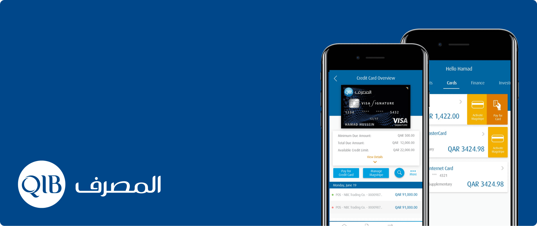
Qatar Islamic Bank (QIB), founded in the late 1900s, operates under the supervision of a Shari’a board to ensure compliance with Islamic banking principles. The bank’s existing mobile app offered only basic banking features and was limited by its dependency on a legacy backend. To modernize, QIB adopted BackBase as its preferred digital banking platform.

Disclaimer: This case study excludes confidential details and reflects my personal observations, not the views of the Qatar Islamic Bank. Privacy and data security of my clients remain my top priorities.
Objective
The goal was to redesign QIB’s legacy mobile app, introduce customer-centric features, and build a seamless omnichannel experience encompassing retail banking, mobile banking, ATMs, call centers, and branch services. Phase 1 focused on delivering an MVP for the mobile app.
My Role: UX & UI Designer
As the sole designer, I handled research, prototyping, visual design, and usability testing.
Project Duration
2 Months (Jan - Mar 2016)
Discovery
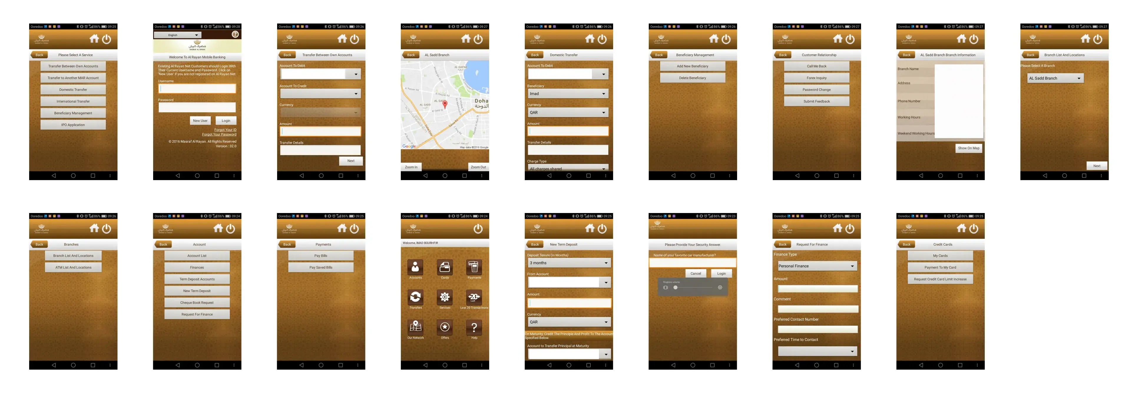
We conducted interviews with stakeholders, including business, tech, support, and call center staff, and reviewed analytics to understand the current system. Additionally, we held open discussions with end-users, targeting three groups: frequent app users, non-users, and extreme users. This approach provided a comprehensive view of how and why customers engage with the QIB app.
User Pain Points
- Payment transfers and registration involve too many steps.
- Mobile truncates account details.
- OTP issues for ex-pats abroad.
- Branch locator is non-functional.
- Frequent updates delay transactions.
- Competitor apps offer better features and usability.
Business Pain Points
- Low mobile app adoption compared to web and branch banking.
- Outdated tech stack hinders adding new services.
- Heavy reliance on branch and call center banking.
- Self-service features like password resets are underutilized.
Key Stats (Indicative)
- 28% of transactions are account transfers; 80% are between QIB accounts.
- 46% of transactions are utility bill payments.
- 21% of transactions are credit card payments.
- 1.2% of transactions are international fund transfers.
- 80% of users log in just to check their account balance.
- 92.5% of utility bill payments occur via mobile banking, while 7.5% use internet banking.
Competitor Analysis
Our primary aim was to innovate and build something that ensures QIB maintains the legacy of the best Islamic mobile app.



Definition
Problem Statement 1
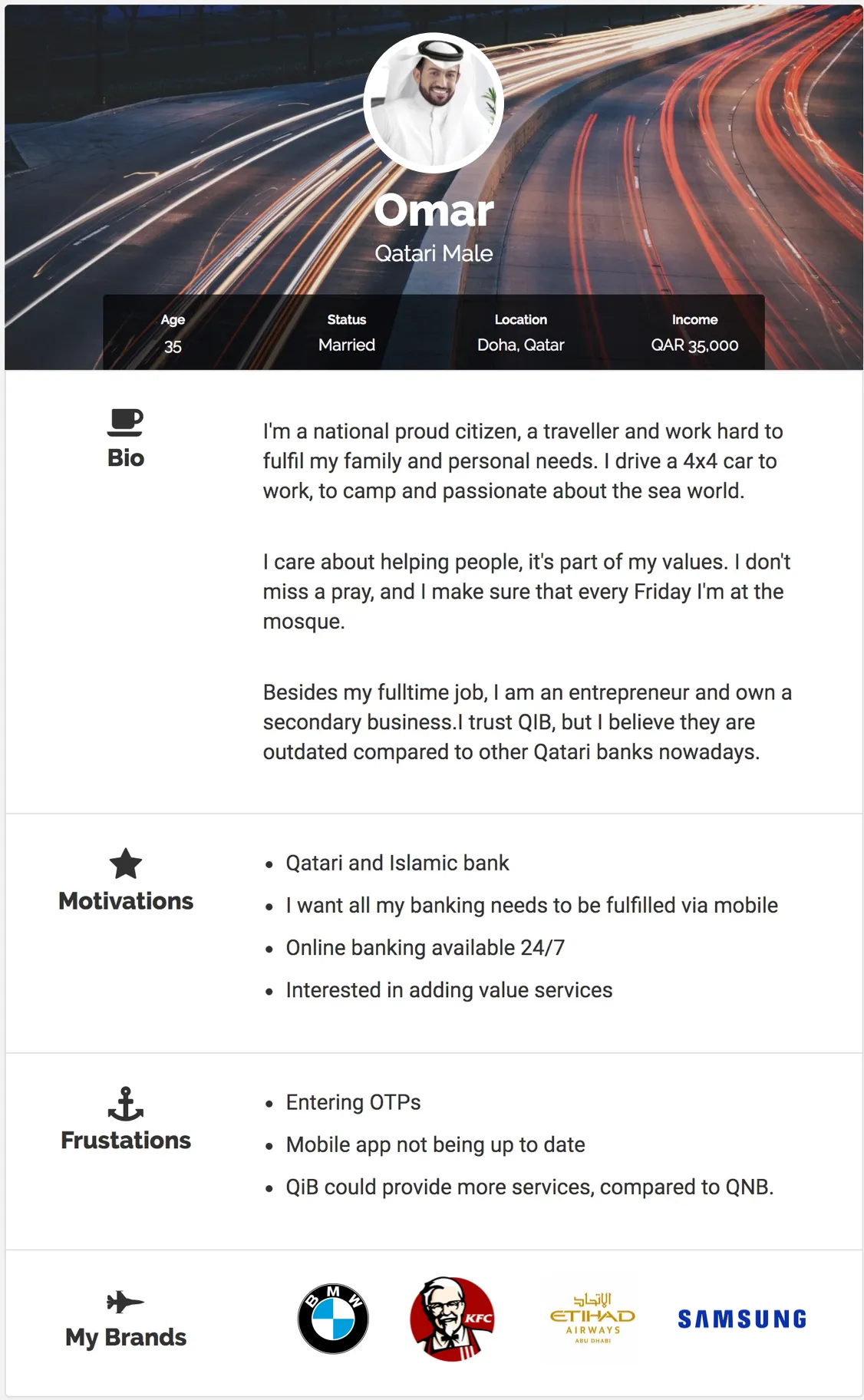
I am a local Qatari QIB user
I am trying to register for mobile banking
But I am unable to complete the registration
Because the process is too complicated and I get frustated easily.
Problem Statement 2
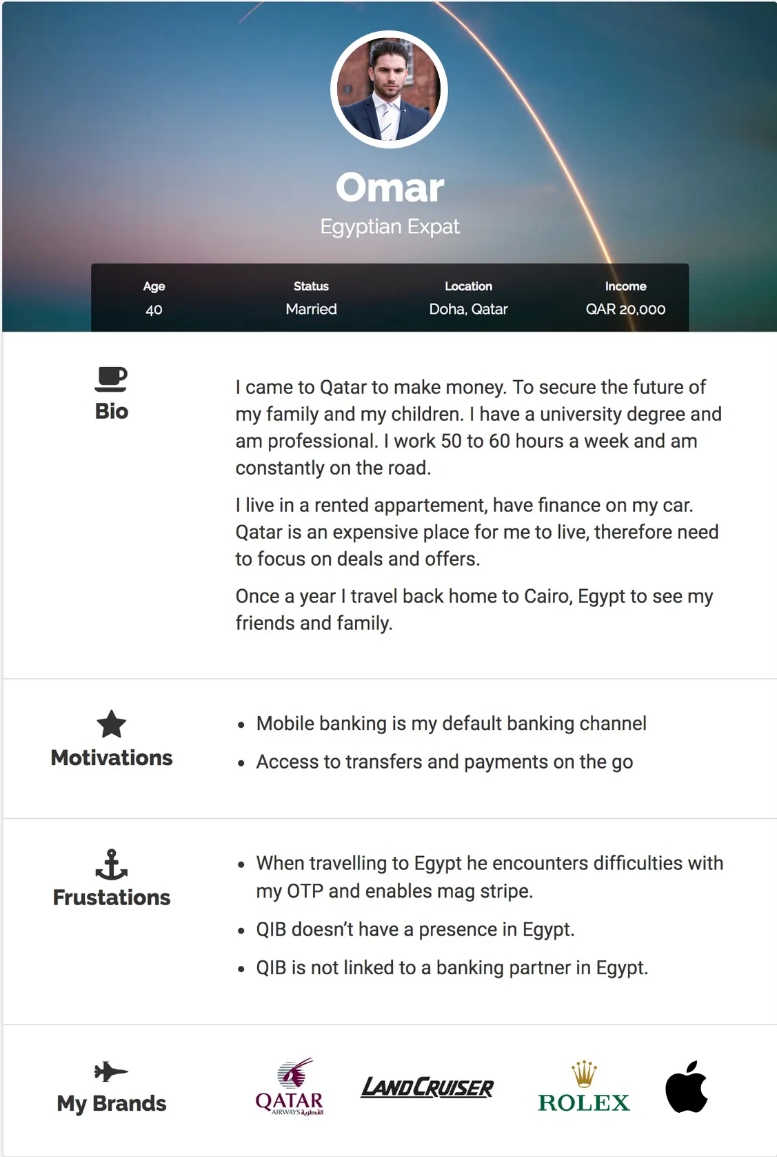
I am an ex-pat QIB user who is currently in my hometown
I am trying to complete a wire transfer
But I am unable to verify the trasaction
Because the OTP gets sent to my local Qatar mobile number
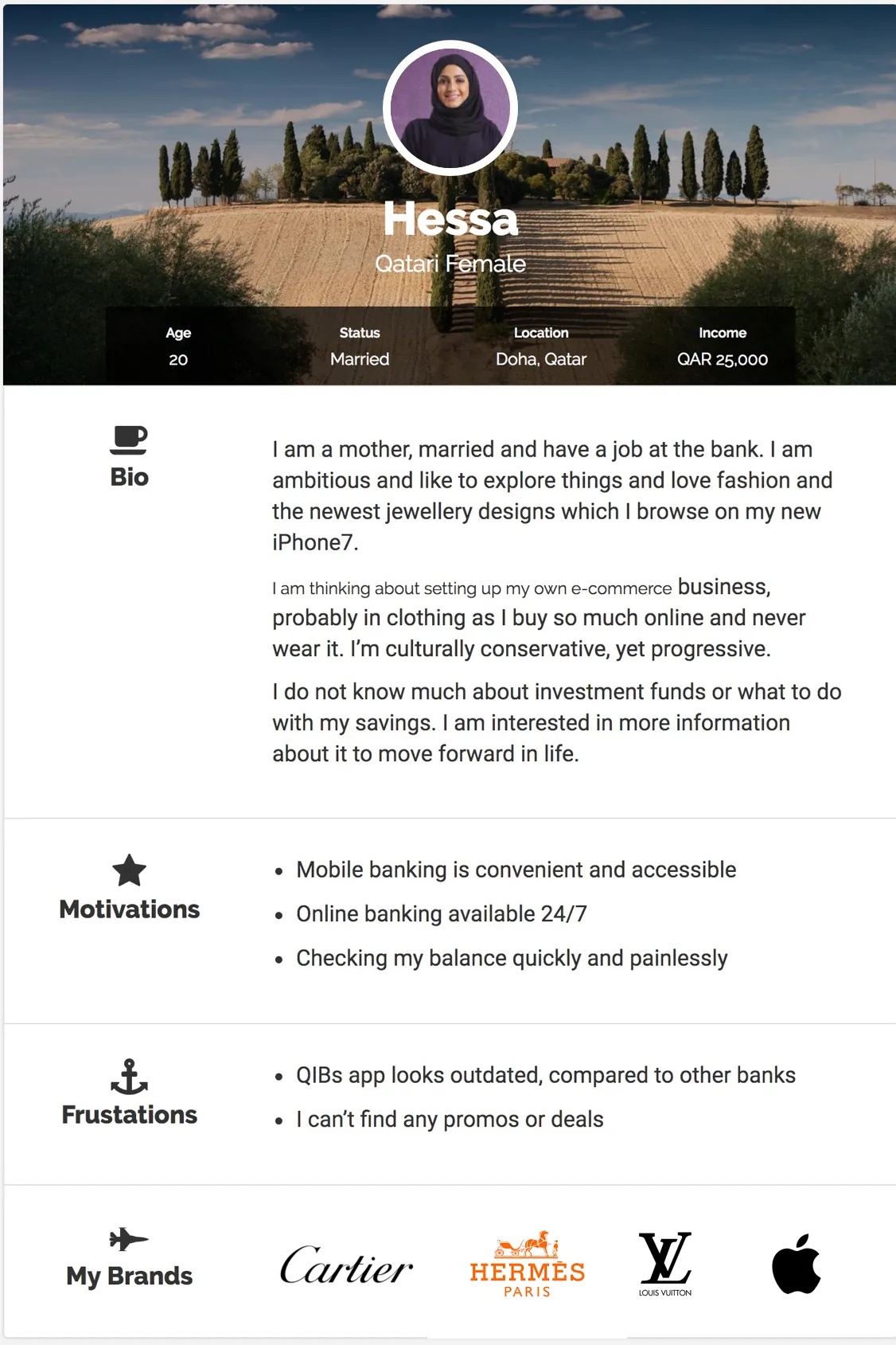
User Persona
User Journey
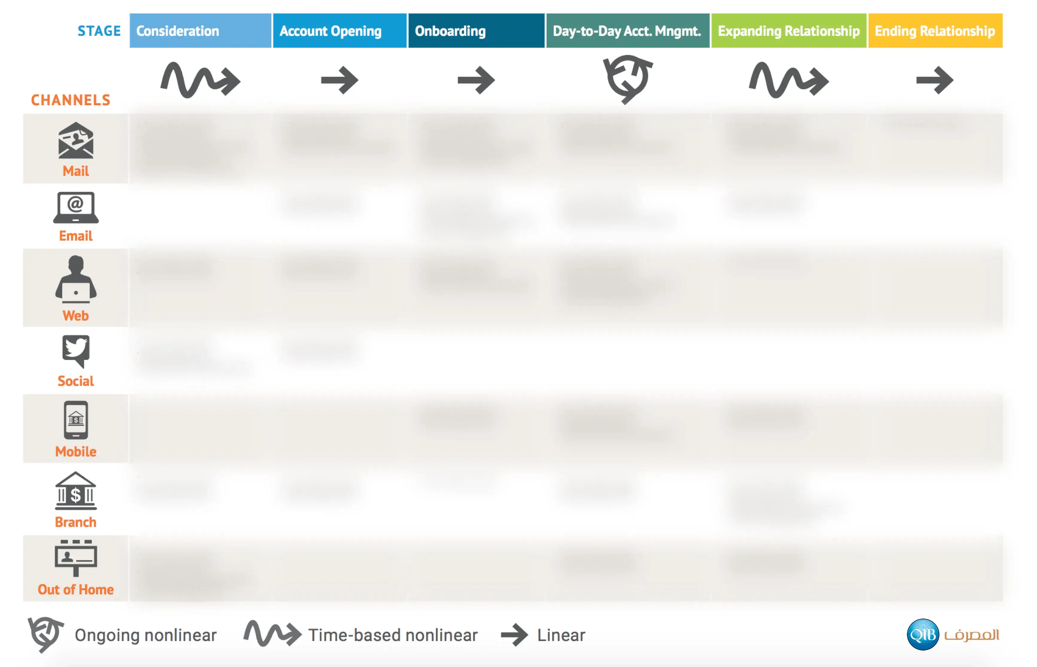
To achieve our vision of an omnichannel experience, we mapped the customer journey across all channels: mobile, web, print, email, branch, social, and marketing. The call center journey was excluded from this phase due to planned reforms, with our involvement scheduled later.
The journey covered the entire lifecycle, from opening a bank account to ending the relationship. While the details are confidential and blurred for privacy, the framework provides a clear view of how the journey was structured.
Key Solutions
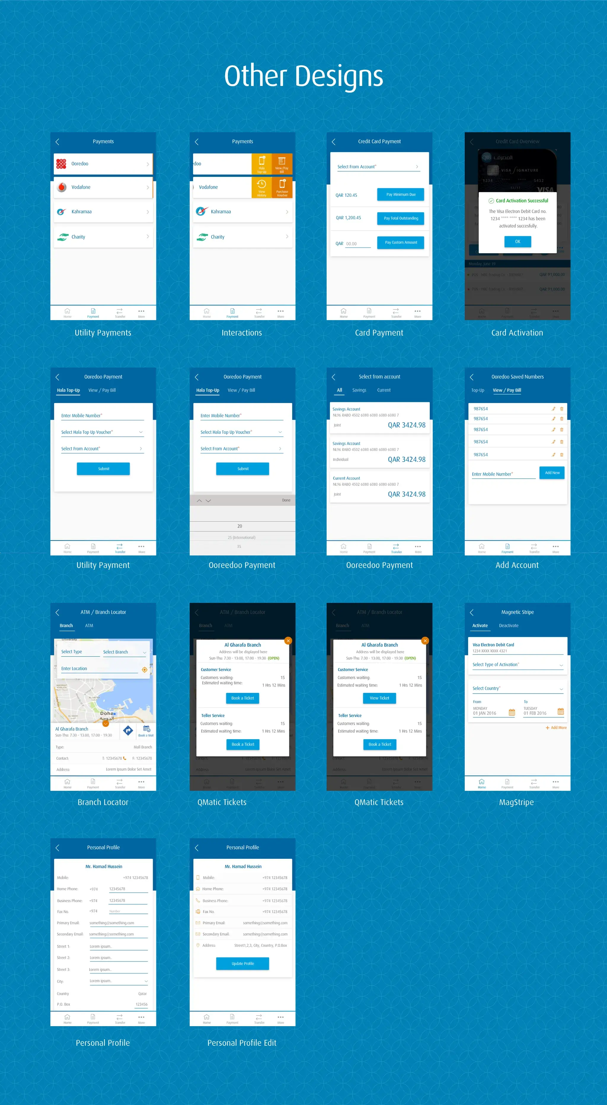
- Biometric login support for iOS and Android.
- QIB authentication app for seamless, OTP-less verification.
- Partnerships with utility providers like Vodafone and Ooredoo.
- Magnetic strip management for cards.
- Integration with charity organizations to support monthly donations, a key Islamic cultural practice.
- Geofencing and iBeacon for branch ticketing and targeted marketing.
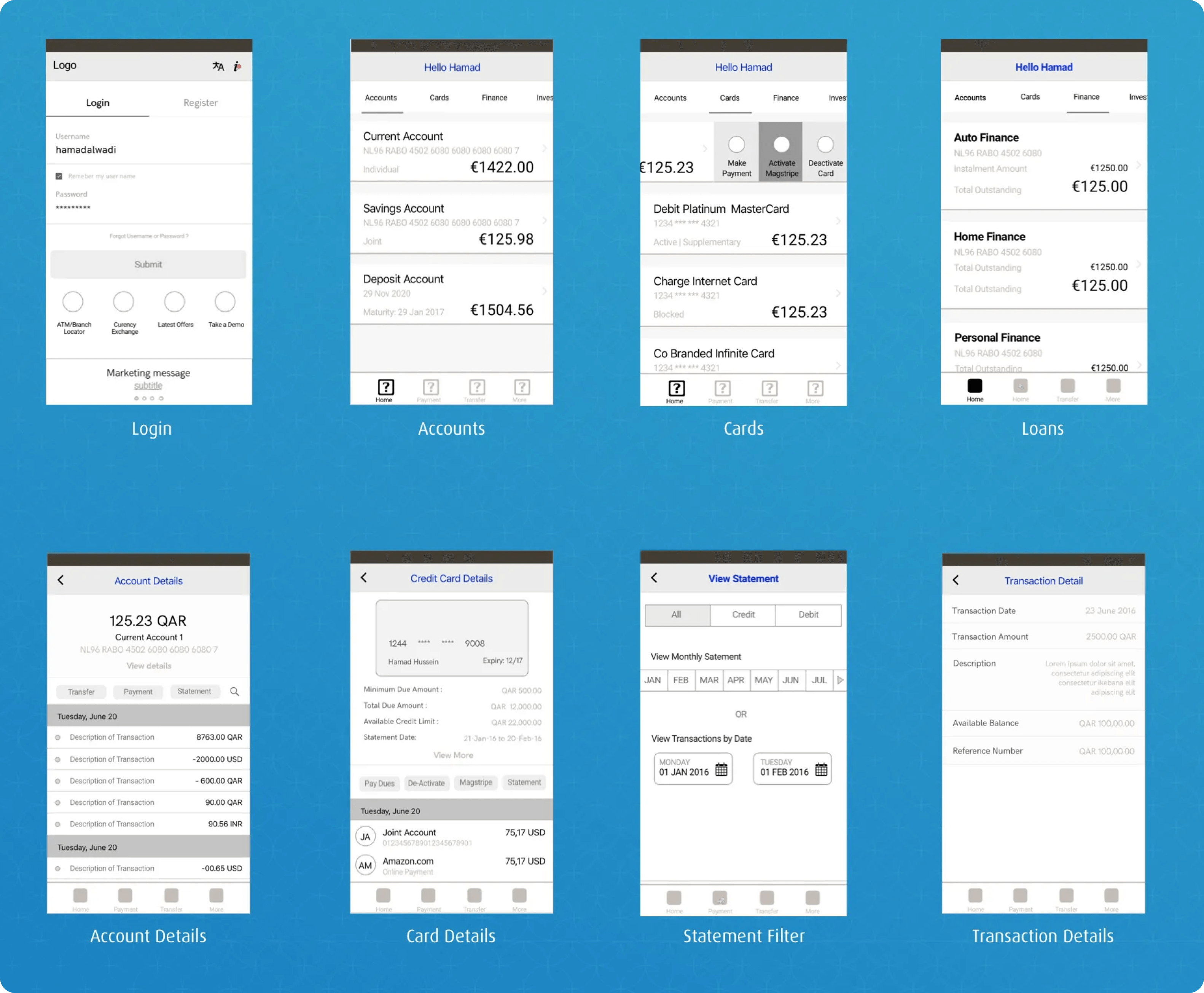
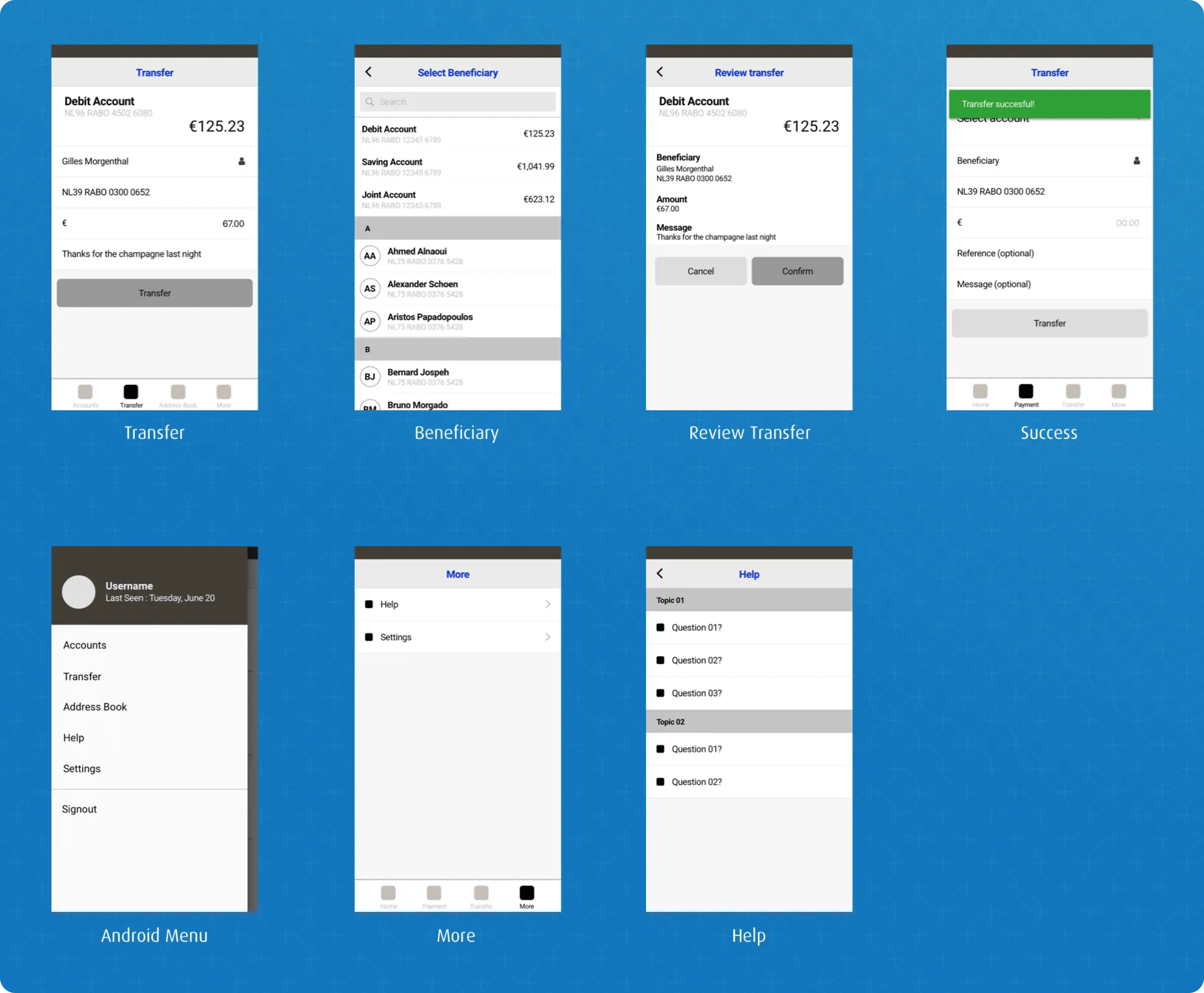
Wireframes
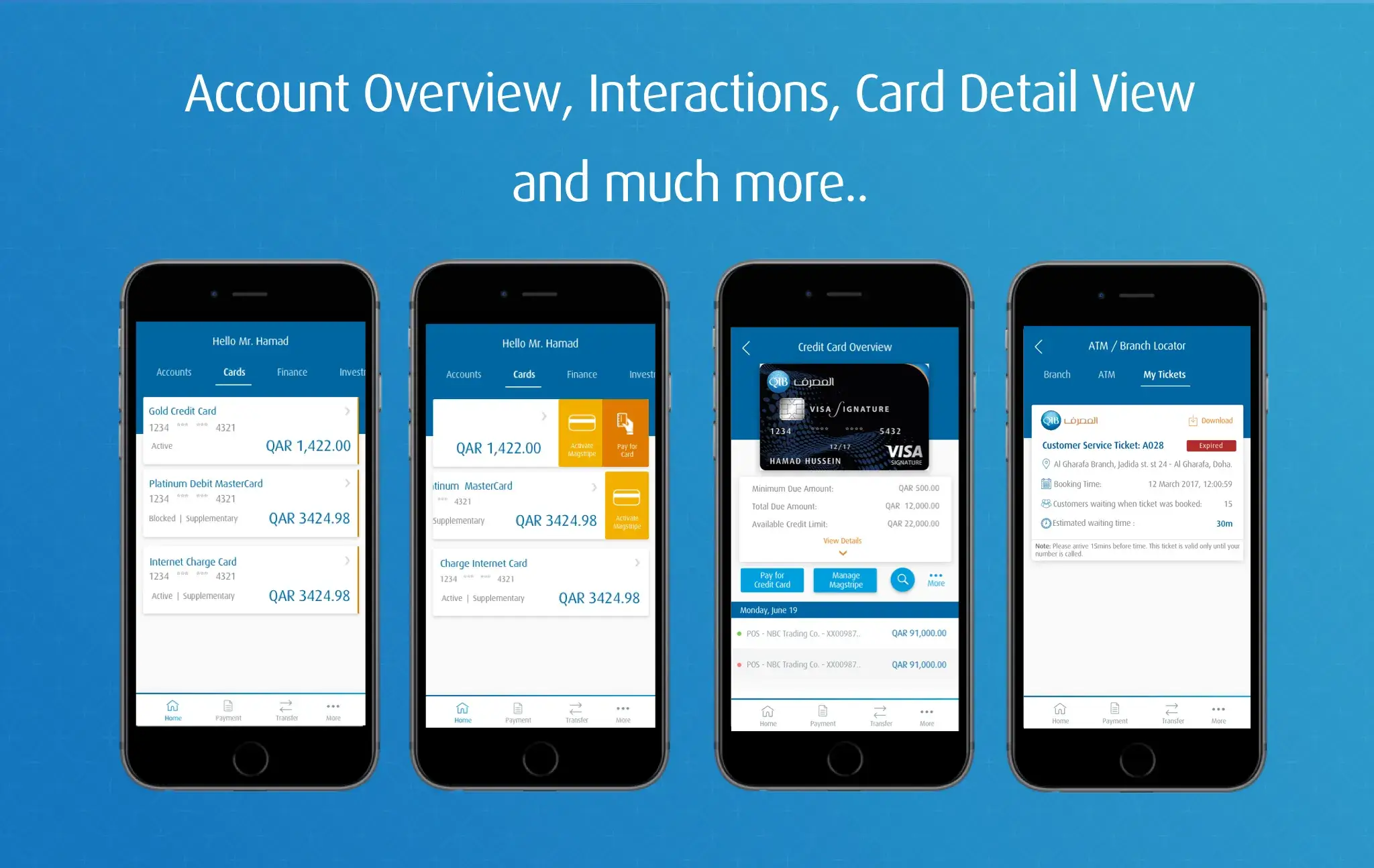
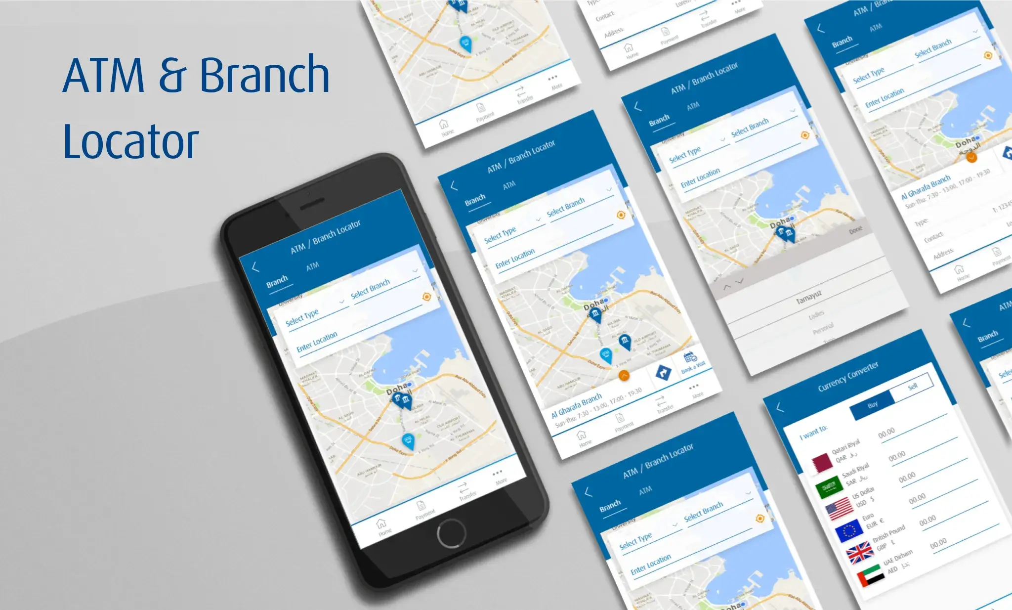
Visuals
Testing
Six users (3 male, 3 female; 50% ex-pats, 50% locals) tested the app on Android and iOS devices, completing tasks like account transfers, beneficiary management, and branch ticket booking in ~30 minutes. Users responded well to the simplified interface, completing tasks successfully, though some challenges were noted:
- Slow page loading when fetching beneficiaries from IBAN.
- Android users avoided swipe gestures, preferring more taps despite swipe actions being native.
- Google Maps CTAs interfered with the app's primary CTAs during branch ticket booking, causing confusion.
Users were interviewed post-testing, and their app journeys were analyzed to identify specific issues. Based on this feedback, the interface was refined to enhance usability.
Results
Design Process
- Research: Conducted context studies, user interviews, and business stakeholder interviews to understand pain points and align goals.
- Definition: Created problem statements, multi-touchpoint user journey maps, and personas while establishing success metrics to measure impact.
- Ideation: Developed feature narratives, sketches, and wireframes focusing on solutions like biometric login, utility payments, and charity integration.
- Design: Crafted visually appealing interfaces aligned with the brand identity, followed by stakeholder reviews to refine the designs.
- Testing: Collected user feedback, conducted usability tests, and analyzed metrics to validate the MVP and guide future iterations.
Learnings
- User-Centric Design: Engaging with diverse user groups highlighted the importance of addressing both frequent users' needs and non-users' barriers to adoption.
- Cross-Channel Consistency: Designing an omnichannel experience reinforced the need for seamless integration across mobile, web, and branch services.
- Simplified Interactions: Observing user reluctance toward certain gestures emphasized the need to balance innovation with familiar interaction patterns.
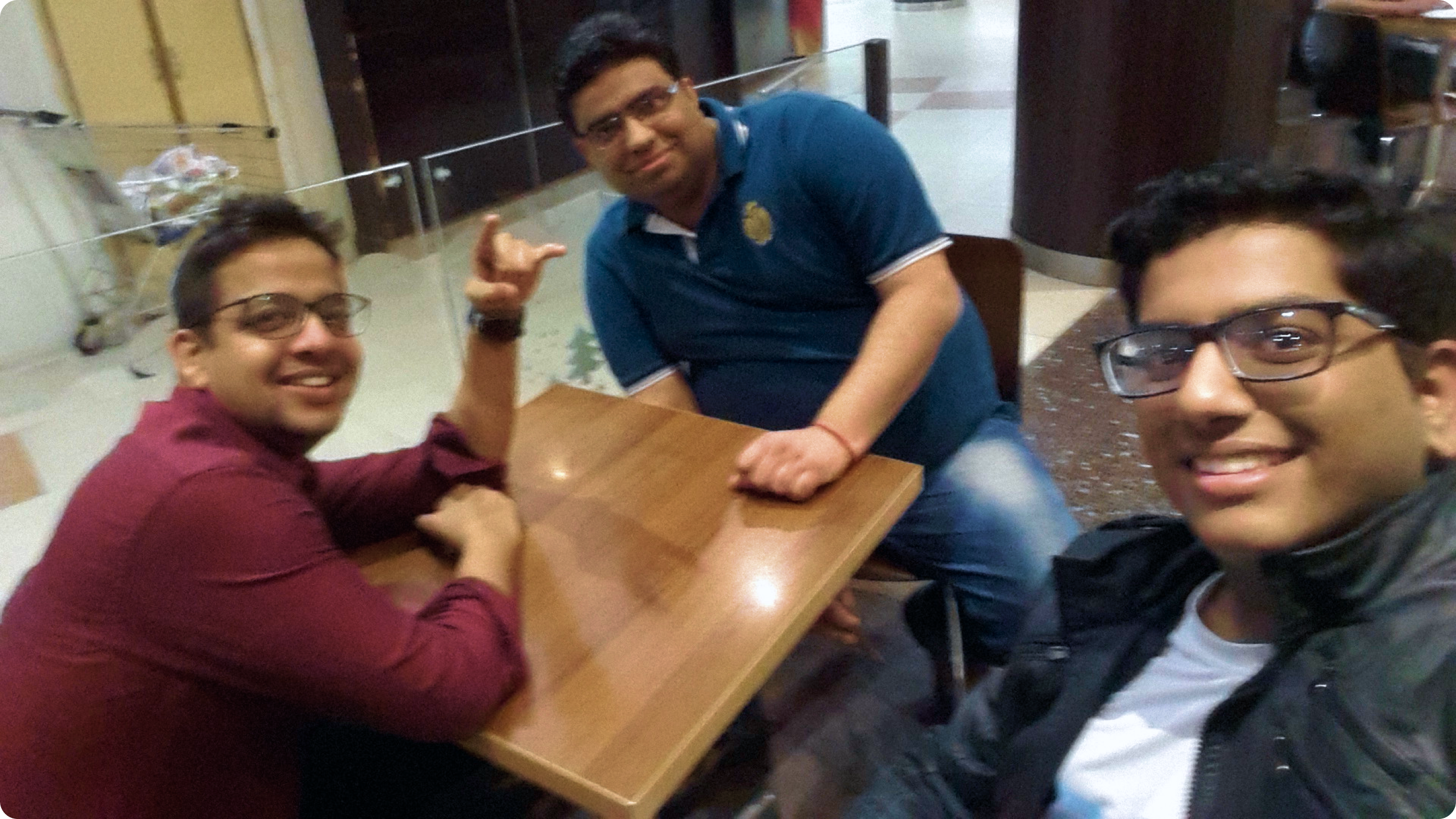
As part of the initial pitching team, I had just 24 hours to fly to Qatar—my first trip abroad, no project details, and a very rough Day 1.
Curious about the above fact, design process, challenges tackled, or the impact created? Let’s dive deeper into the story! I’d be delighted to share more insights.
Send a Message on LinkedIn
Read Another Case Study
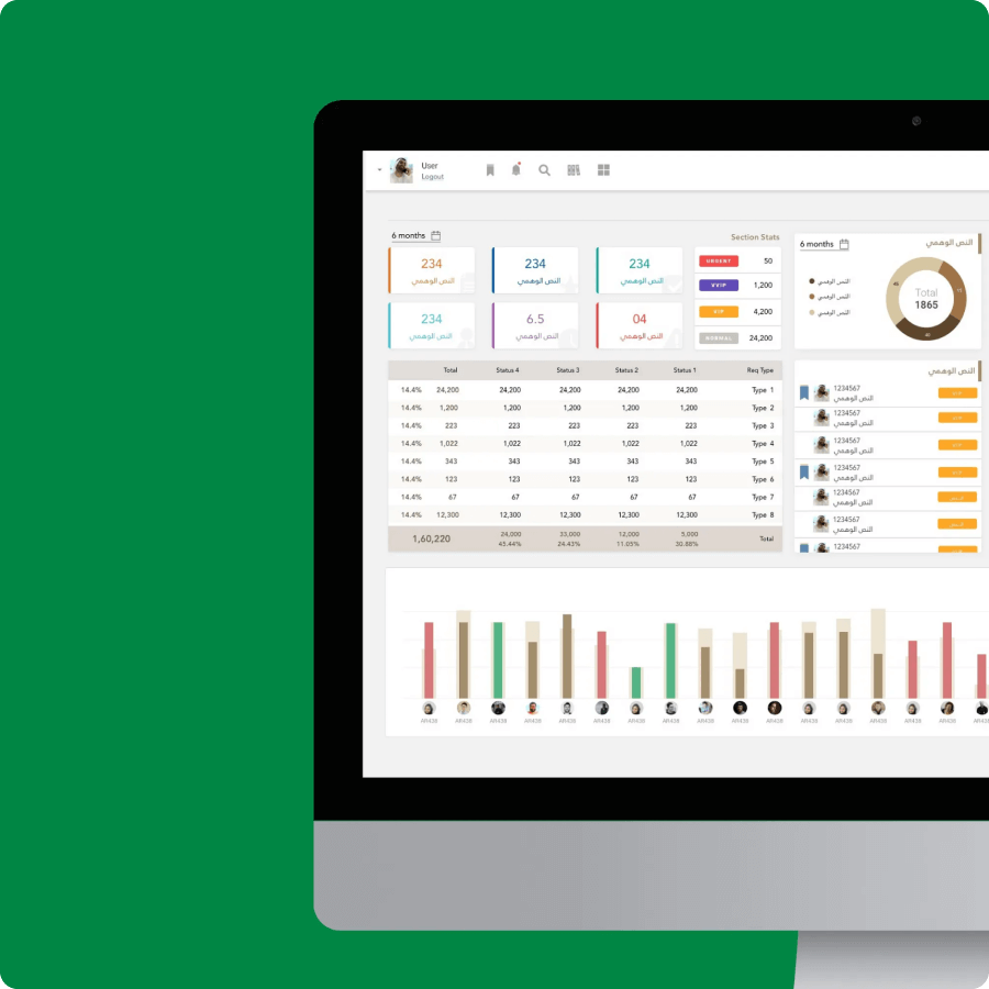
Redefining Enterprise UX for the Crown Prince Court of Abu Dhabi
Digitizing CPC workflows to streamline citizen aid services, pilot scalable solutions, and minimize paper-based processes for environmental sustainability and efficiency.
