All work
Loyalty & rewardsWebsiteMobile appBrand theme

BonusLink: one rewards brand, from homepage to member dashboard

BonusLink is one of Malaysia's longest-running loyalty programmes. Its website, travel pages and BLINK app had grown up separately, each with its own look. I redesigned the homepage and the member dashboard, and used them to set a single theme for the whole brand.
Year2026
My roleLead product designer
ScopeWebsite, travel, BLINK app
MarketMalaysia
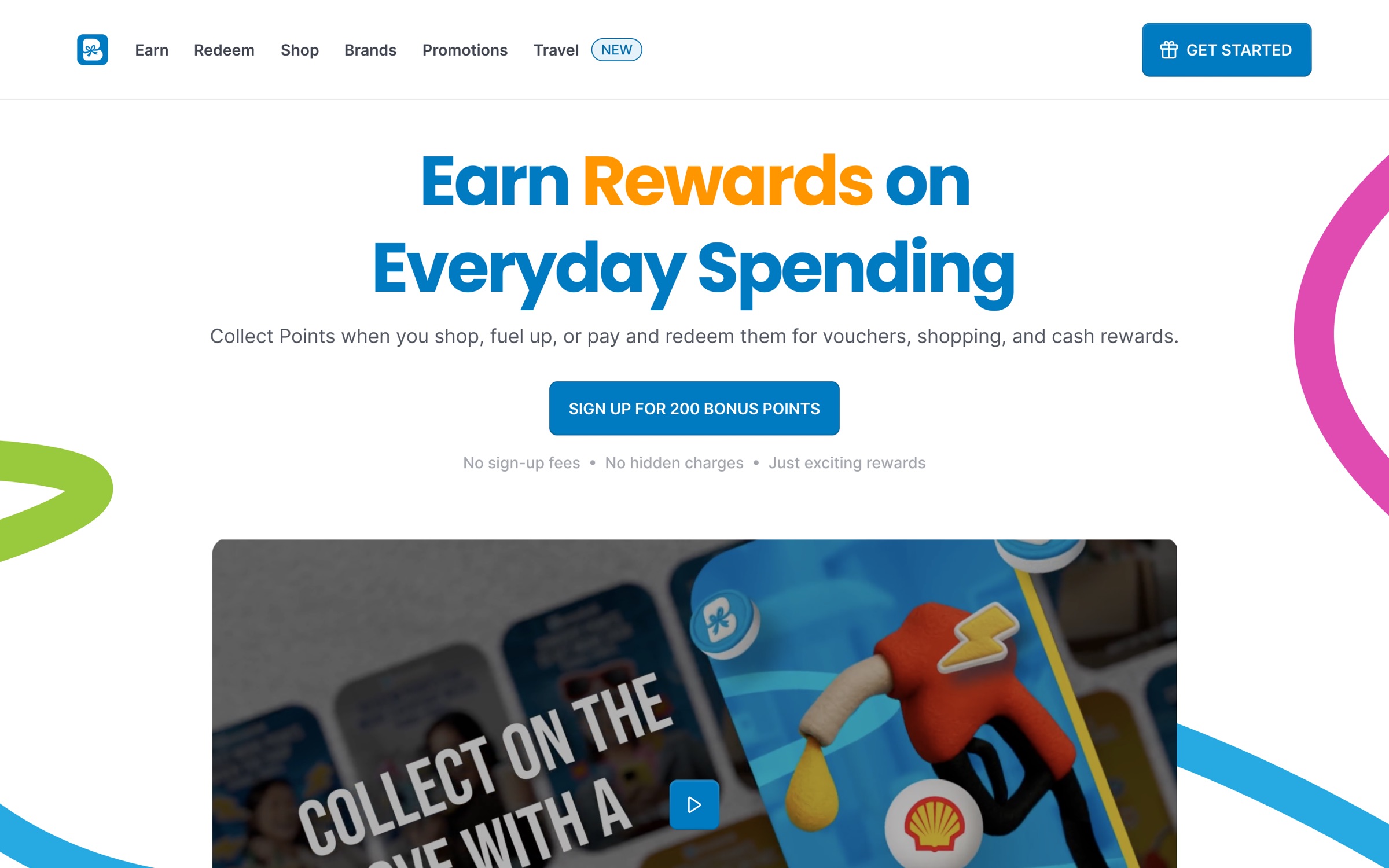
The redesigned homepage: one promise, one sign-up offer, and the brand's colour ribbons framing the story.

The redesigned homepage: one promise, one sign-up offer, and the brand's colour ribbons framing the story.

At a glance

What I delivered.

50+
Standard components
1
Standard theme across web and app
20
Screens redesigned
Before the work started

What we believed, what stood in the way, and where the opening was.

Assumption

People already know how points work.

The old pages led with partner logos and offers. New visitors had to work out for themselves how to earn, where to spend and why to sign up.

Challenge

Every surface looked different.

The website, travel pages and app used different blues, type, cards and illustration styles, so the brand felt like several products.

Opportunity

Make the system the brand.

A small set of tokens, a component kit and one mascot could carry a consistent feel everywhere, and make new pages quick to build.

The brief

BonusLink members collect points at fuel stations, department stores, banks and online partners, then spend them on vouchers, shopping, travel and bills. The idea is simple. The website didn't make it feel simple.

The brief had three parts: a homepage that explains earn, redeem and pay in seconds, a member dashboard in the BLINK app that answers "what do I have and what can I do with it?", and a theme strong enough to hold the whole brand together.

Setting the theme

I started with the theme rather than a page, because every screen after it would inherit its decisions.

  • Colour as tokens, not hex codes. A bright primary blue for anything you can act on, a deep navy for grounding bands, and green, orange and pink saved for reward moments. Each colour is named by role and step, so designers and developers use the same names.
  • Ribbons as the motif. Loose colour ribbons sweep through heroes and photography. They make banners feel related without copying one layout.
  • Blinkie as the voice. The brand's cat mascot shows up for loading, celebrating, empty states and the footer, and even prints on the physical cards.
  • Real photography of real partners. Fuel attendants, shoppers and travellers instead of stock abstractions, so each partner card shows what you'd actually earn.
Brand primaryActions, links, the points balance
25#E6F2F9
100#99CAE6
400#1A87C6
500#007AC0
600#0092CF
800#005586
Brand secondaryDeep navy for footers, hero bands and splash
100#B5C5E2
700#052F6F
800#03265C
950#011437
AccentsReward moments, used sparingly
Green 400#A3CE50
Green 600#8AB536
Orange 500#FF9600
Pink#FF5093
Magenta#DF4BB1
NeutralsSurfaces, borders and body text
Gray 50#FAFAFA
Gray 200#E9EAEB
Gray 500#717680
Gray 800#252B37
White#FFFFFF
The colour tokens behind every screen, named by role and step so web and app pull from one source.
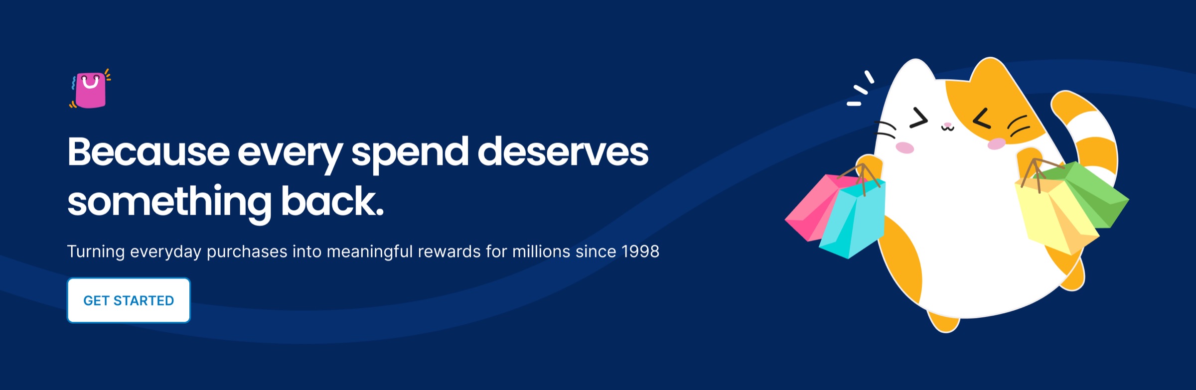
A campaign band built from the theme: navy base, primary blue, ribbon and Blinkie.
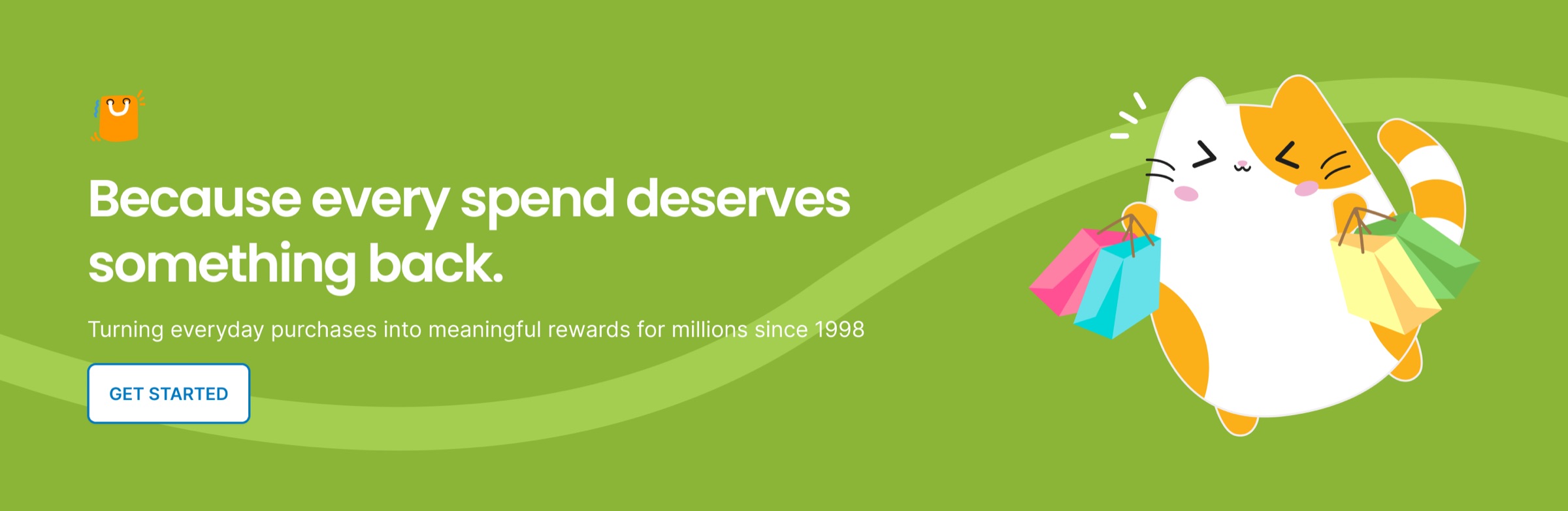
The same band recoloured from the accent palette, for a seasonal or partner campaign.
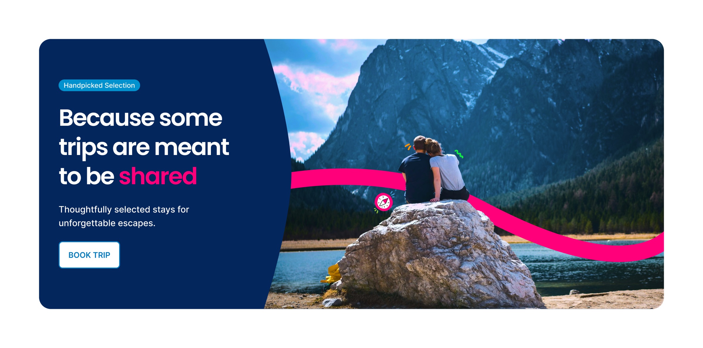
Photography with the ribbon motif carrying across the image, used for the travel vertical.
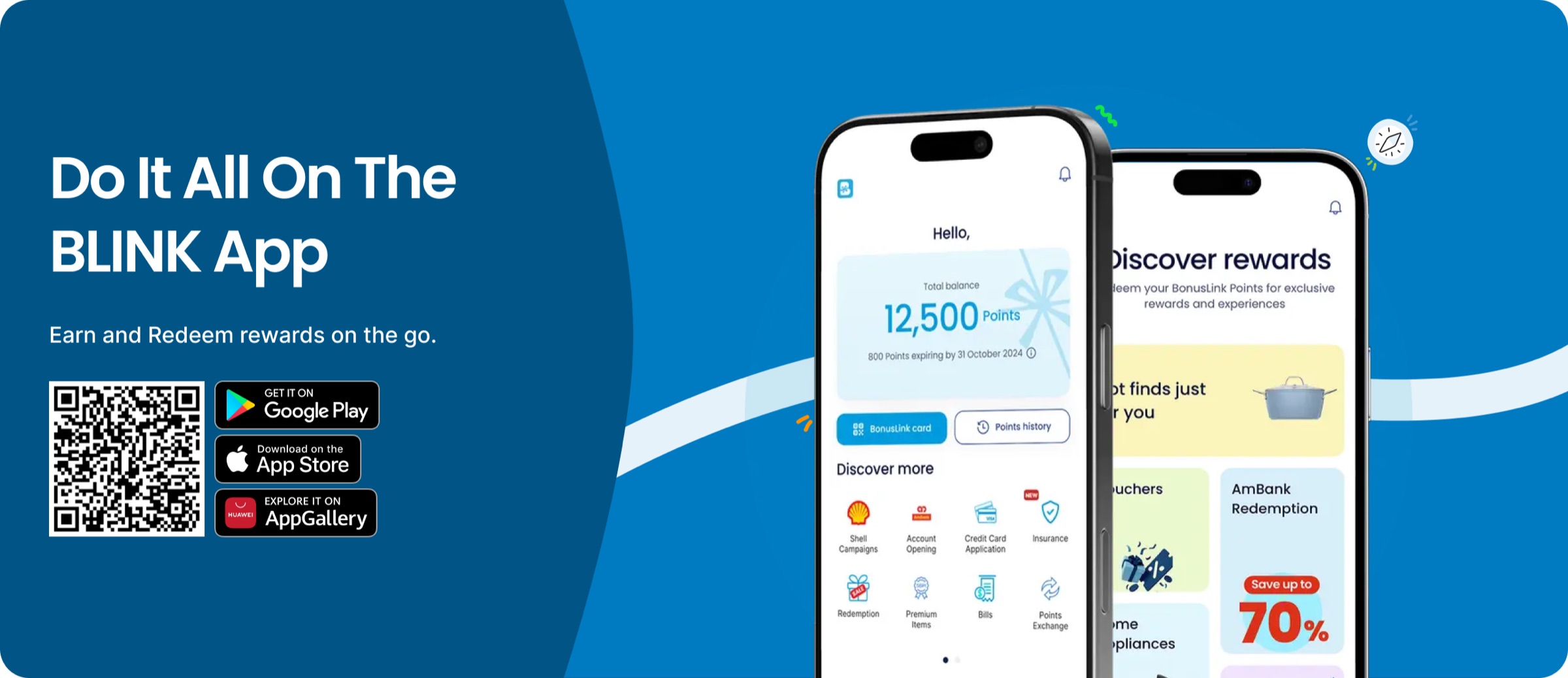
The app download band, reused on the homepage, travel pages and footer.

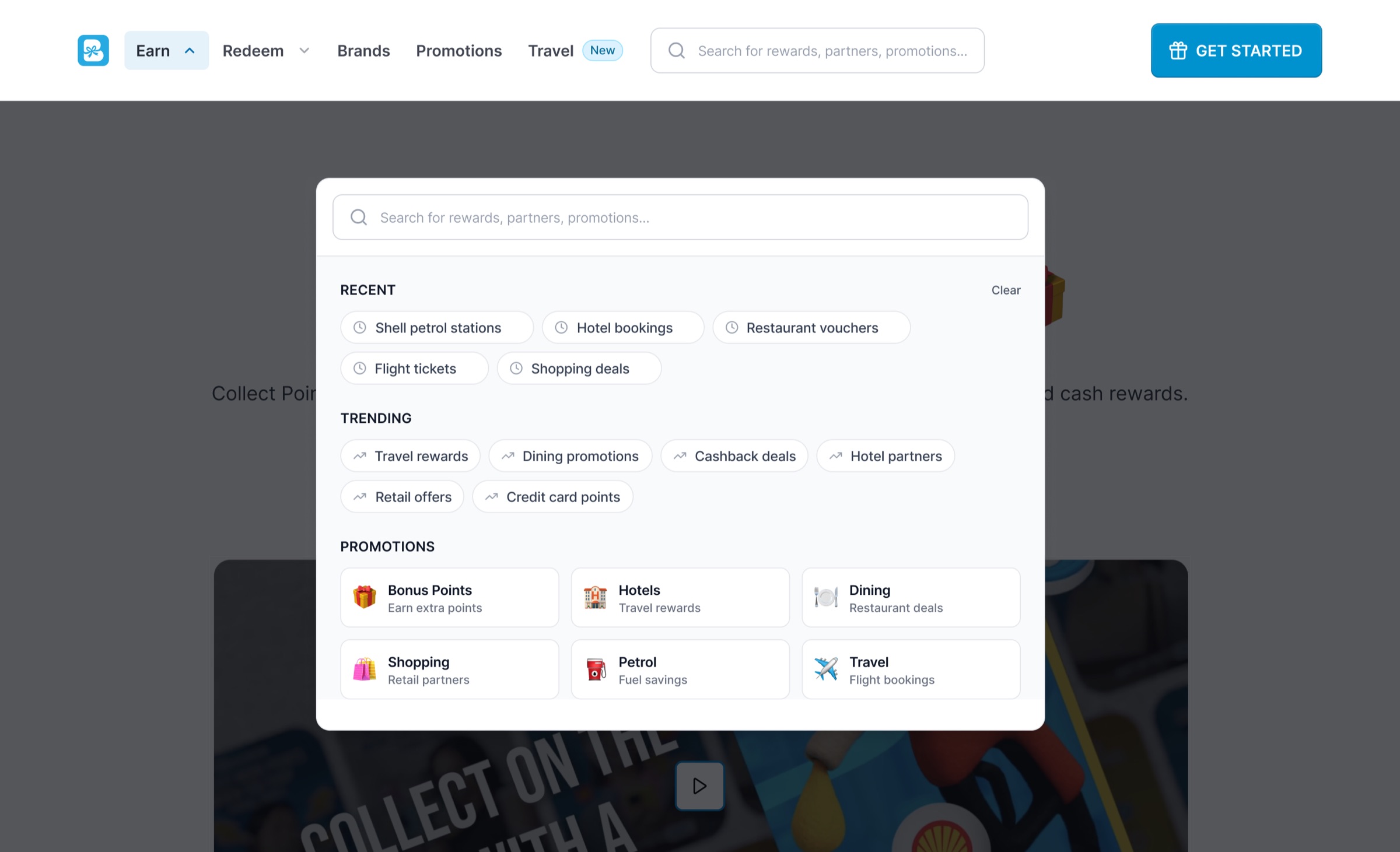
The old menu listed sections. The new one answers questions. Earn and Redeem open mega menus grouped by everyday life (mobility, lifestyle, finance and e-commerce), each ending with a nudge to the app. Search opens with suggestions and recent partners before you type.
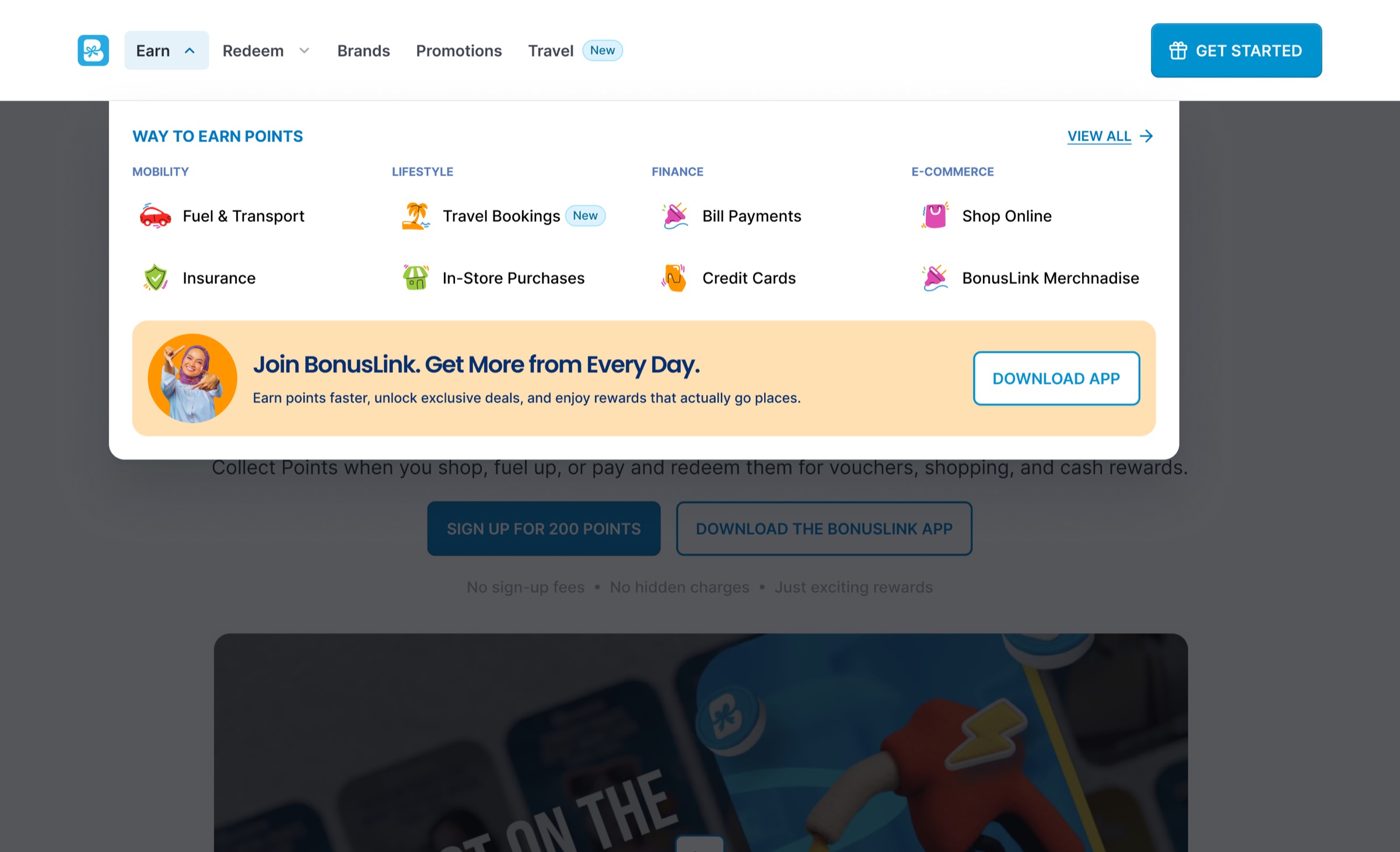
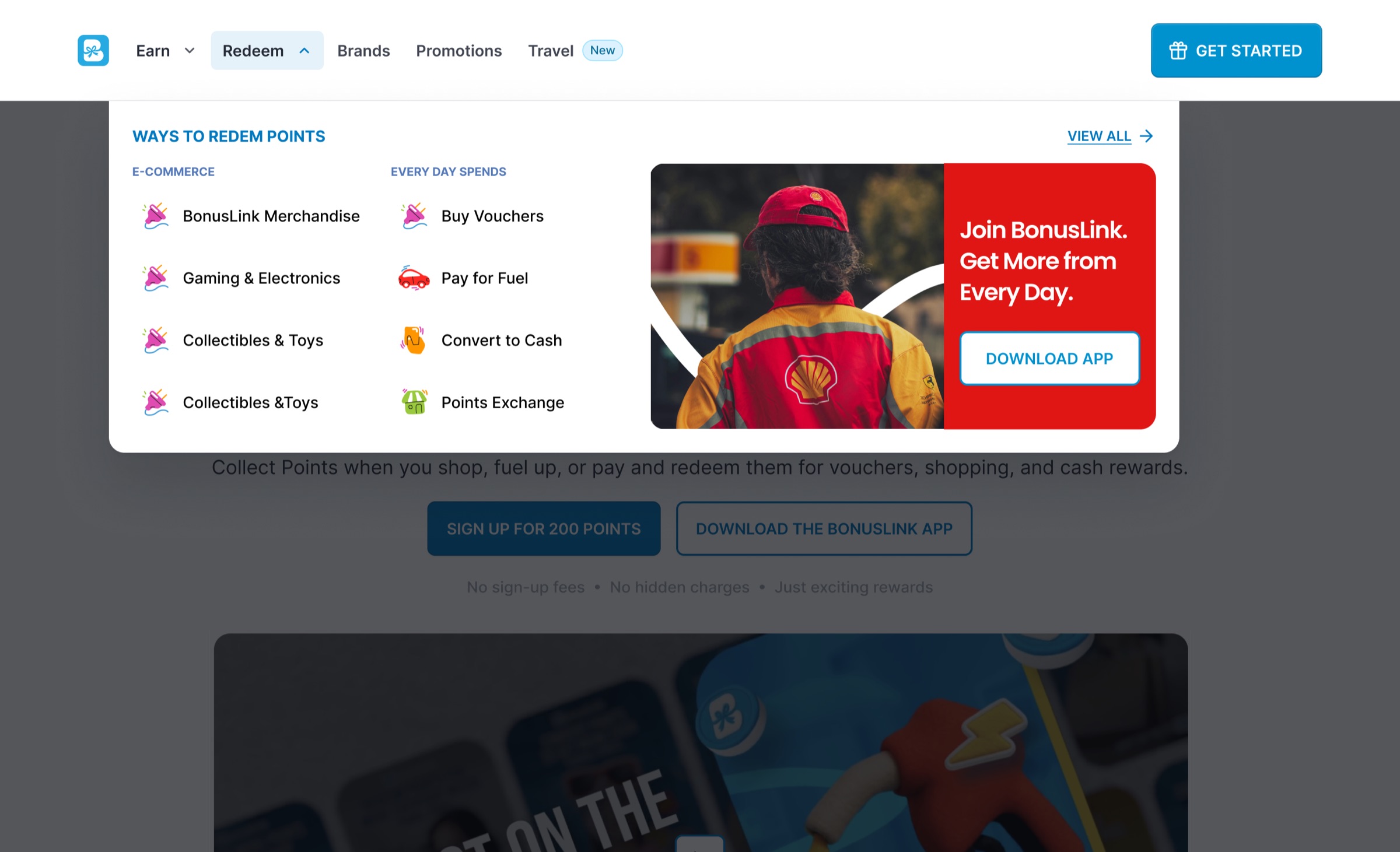
Earn mega menu: ways to earn grouped by category, with a 'New' tag on travel and an app nudge.
Redeem mega menu: the same structure, so learning one menu teaches the other.
Search overlay with suggested categories and partners before the first keystroke.

The homepage

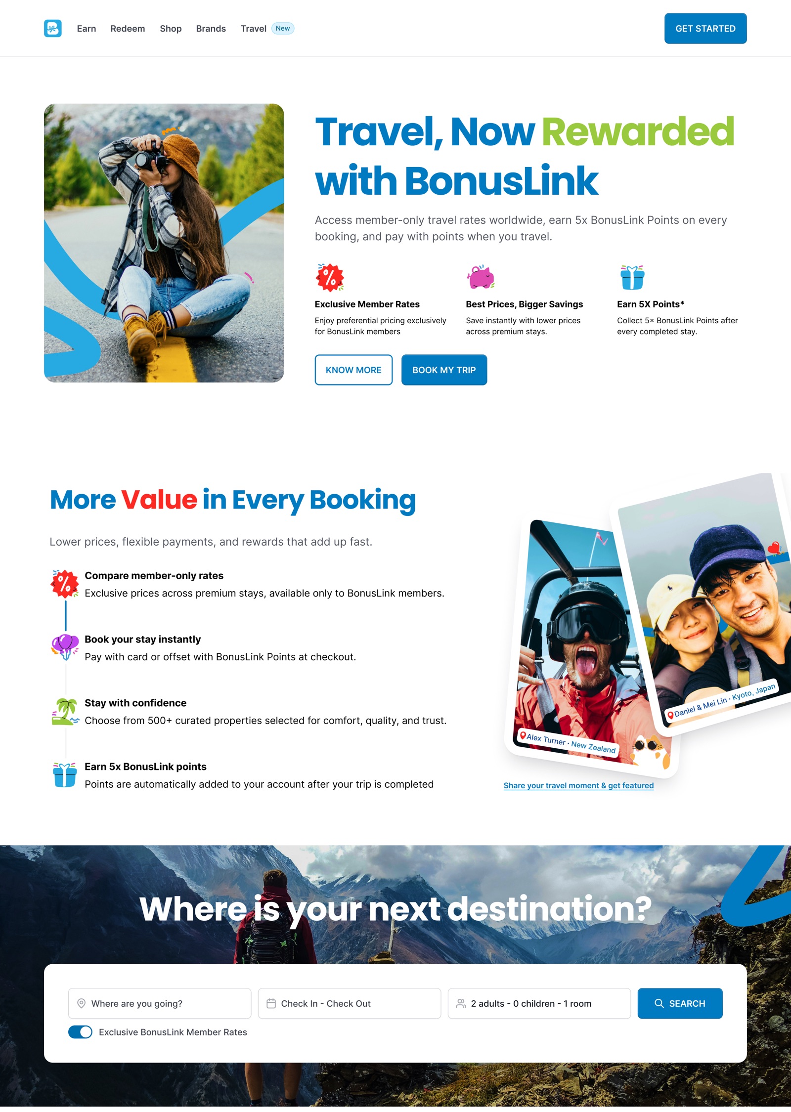
The page follows the order a new visitor needs things in: what this is, how you earn, how you spend, who the partners are, and then what you can get today.

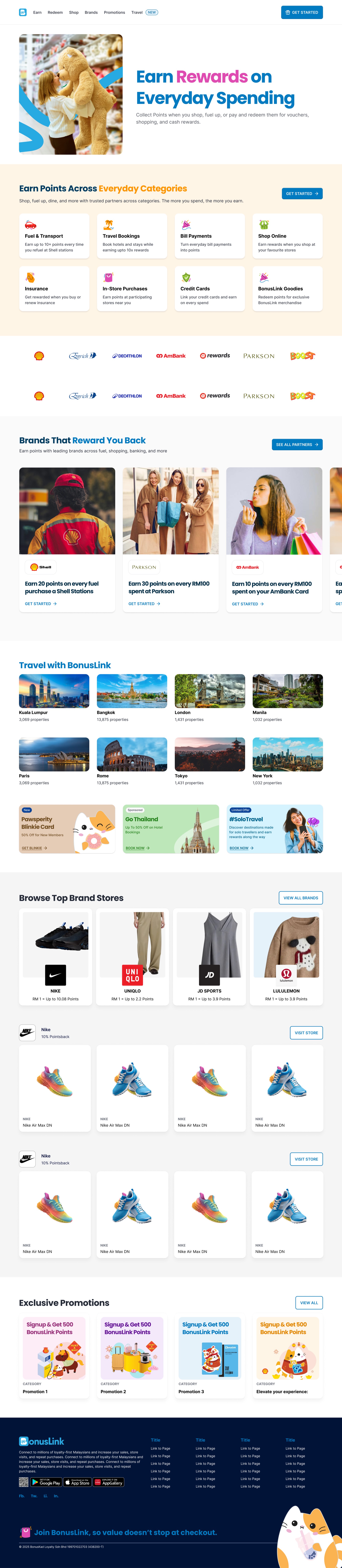
  • One promise, one offer. "Earn rewards on everyday spending" and a single 200-bonus-point sign-up, with the reassurance (no fees, no hidden charges) right under the button.
  • Earn, redeem, pay. Three bands, each with a photo, a plain sentence, partner examples and the full list of categories alongside.
  • Partners that pay you back. Big partner cards state the reward in plain numbers, such as 20 points on every fuel purchase.
  • Then the shop. Online shop, physical cards, vouchers, travel and promotions come after the explanation, as proof rather than noise.
bonuslink.com.my · HomeOpen full page
The full desktop homepage. Scroll inside the window, or open the full page.
Earn landing pageOpen full page
An alternative direction led by earning categories, tested as an earn landing page.
The homepage on mobile: the same story, stacked, with rails you swipe.
Home · variant BOpen full page
A shorter homepage variant with colour-coded earn, redeem and pay bands.

Travel, the newest vertical

Travel launched as a new way to earn and burn points on hotel stays. It had to feel like BonusLink, not a white-labelled booking engine, so it uses the same bands, cards and ribbons with a search widget at its heart.
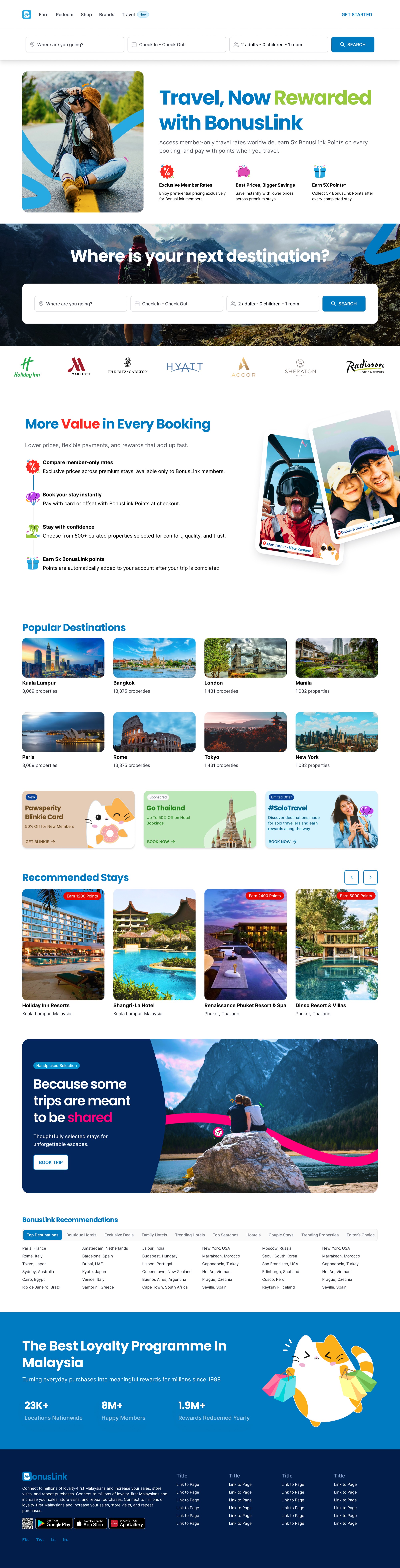

The travel landing page: member rates, destinations, recommended stays and an SEO link block above the footer.
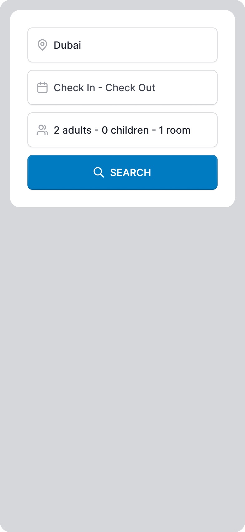
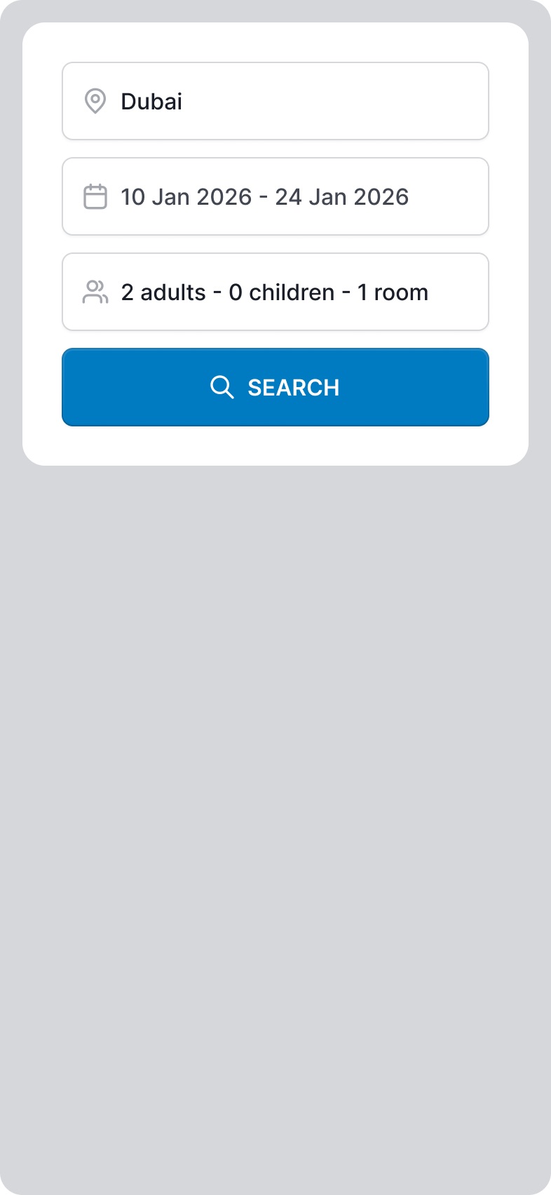
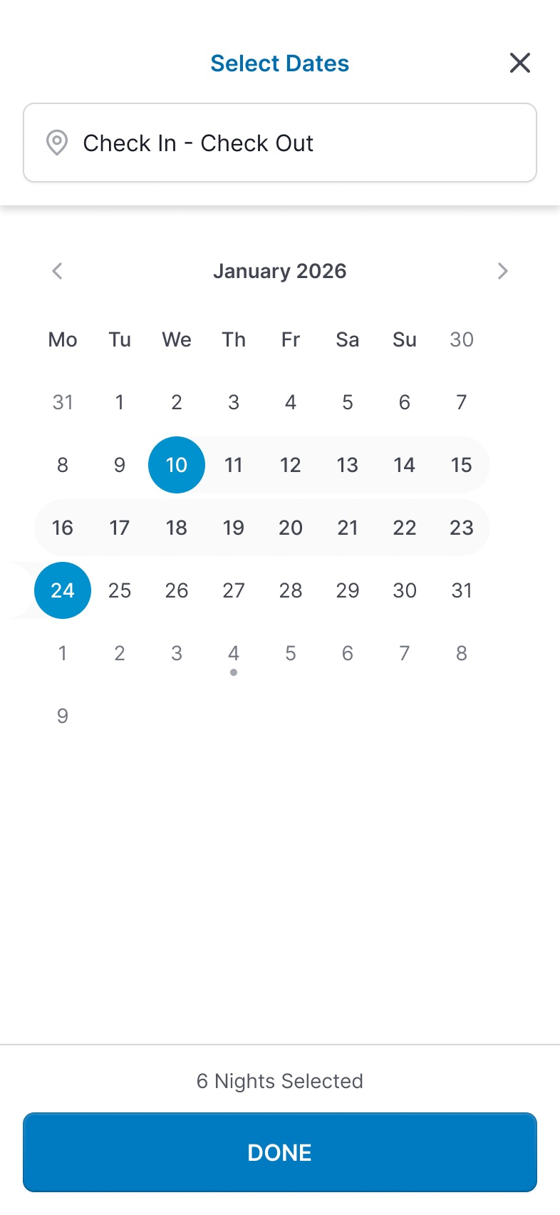
The search bar component: destination, dates and guests in one line.
Search, collapsed
Destination
Dates
Guests
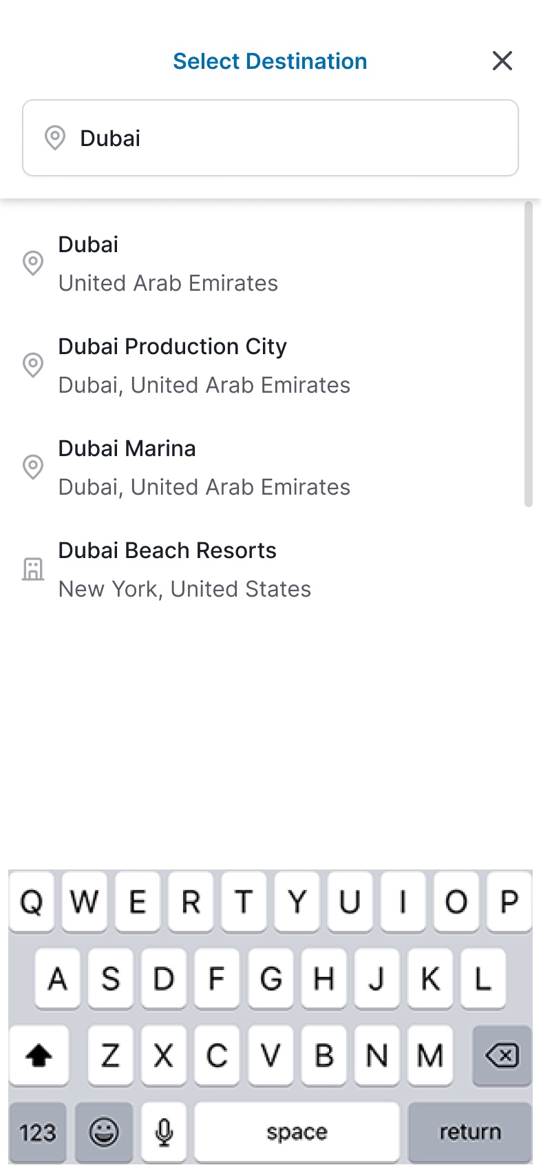
The same widget on mobile, broken into one decision per step.

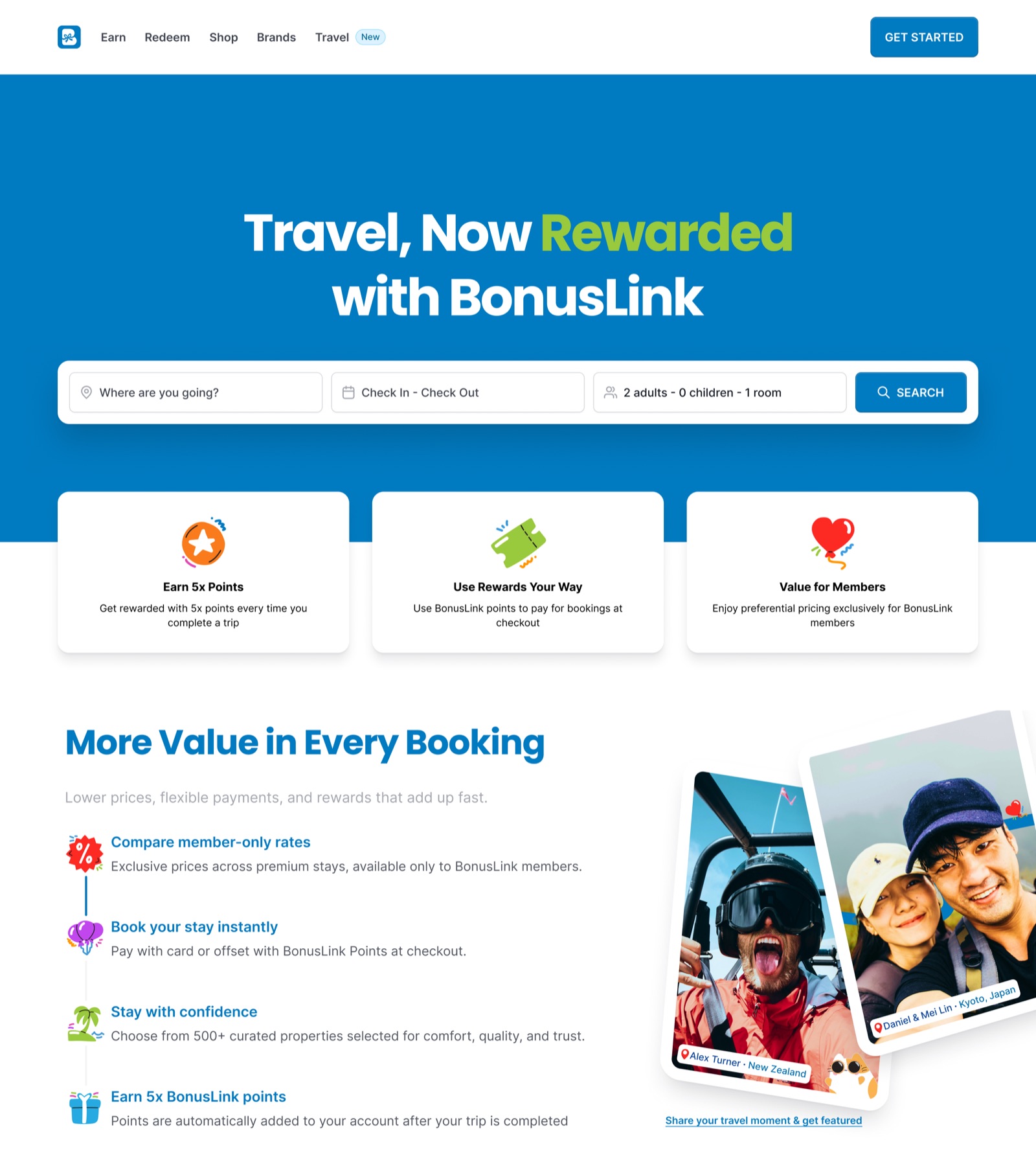
It took several rounds to get there. Early versions led with the search form and a dense grid. Later ones led with the member benefit and pushed search into the hero.
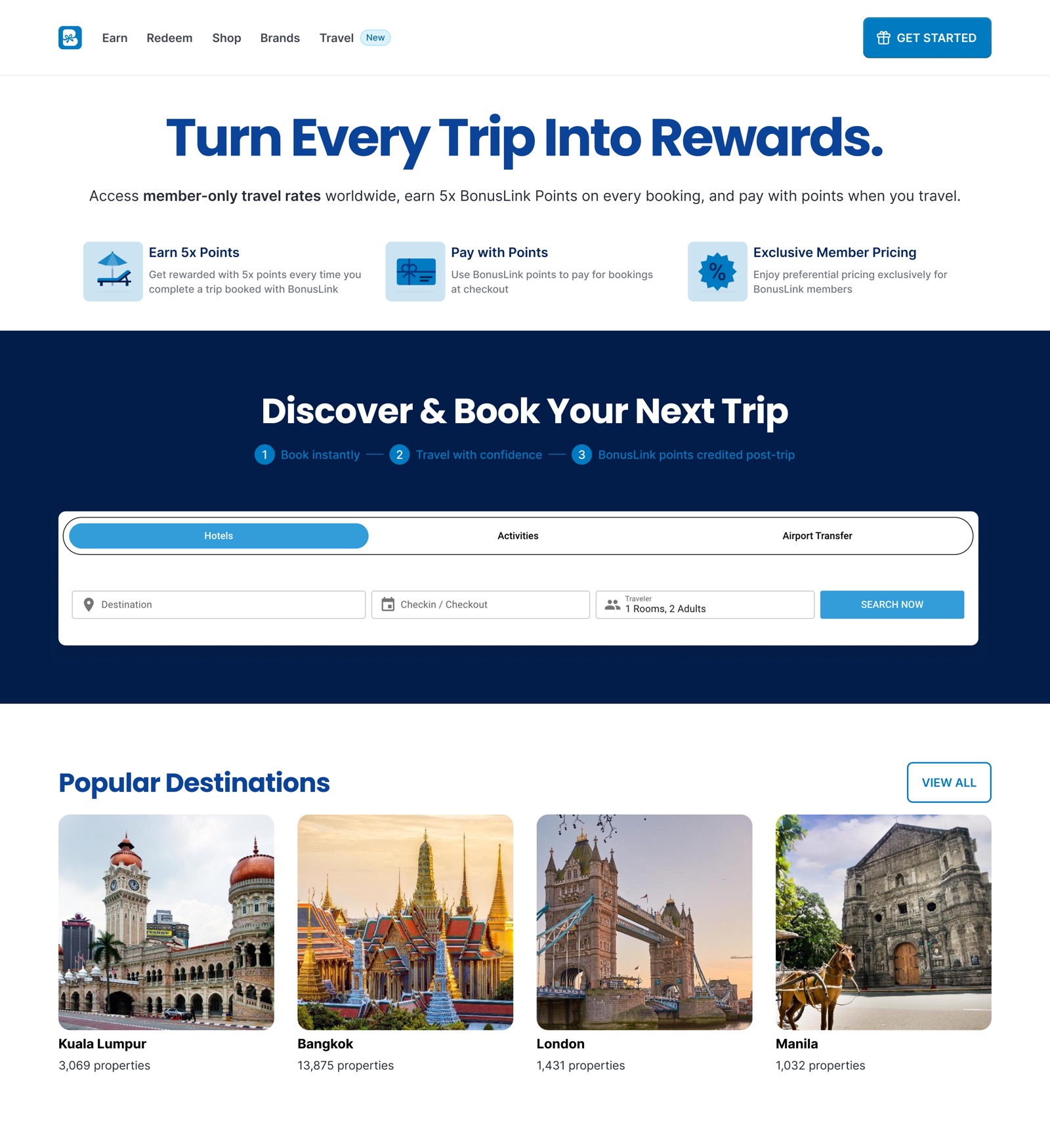
Round 1: search first
Round 2: benefit first
Round 3: closer to final
Travel iterations, from a search-led page to a benefit-led one: the top three sections of each round.
Part two

Mobile app redesign, and one theme for an omnichannel experience.

The same tokens, components and Blinkie carried from the website into the BLINK app, so members get one brand wherever they earn and spend.

Onboarding in the BLINK app

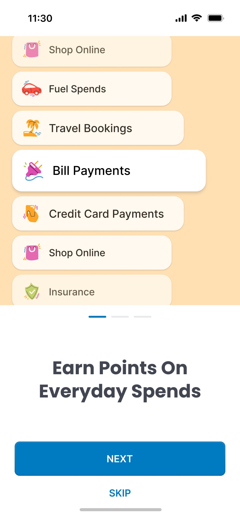
The app's first minutes do three jobs: explain the value, get a verified member, and learn enough to personalise the dashboard. Blinkie keeps it light along the way.
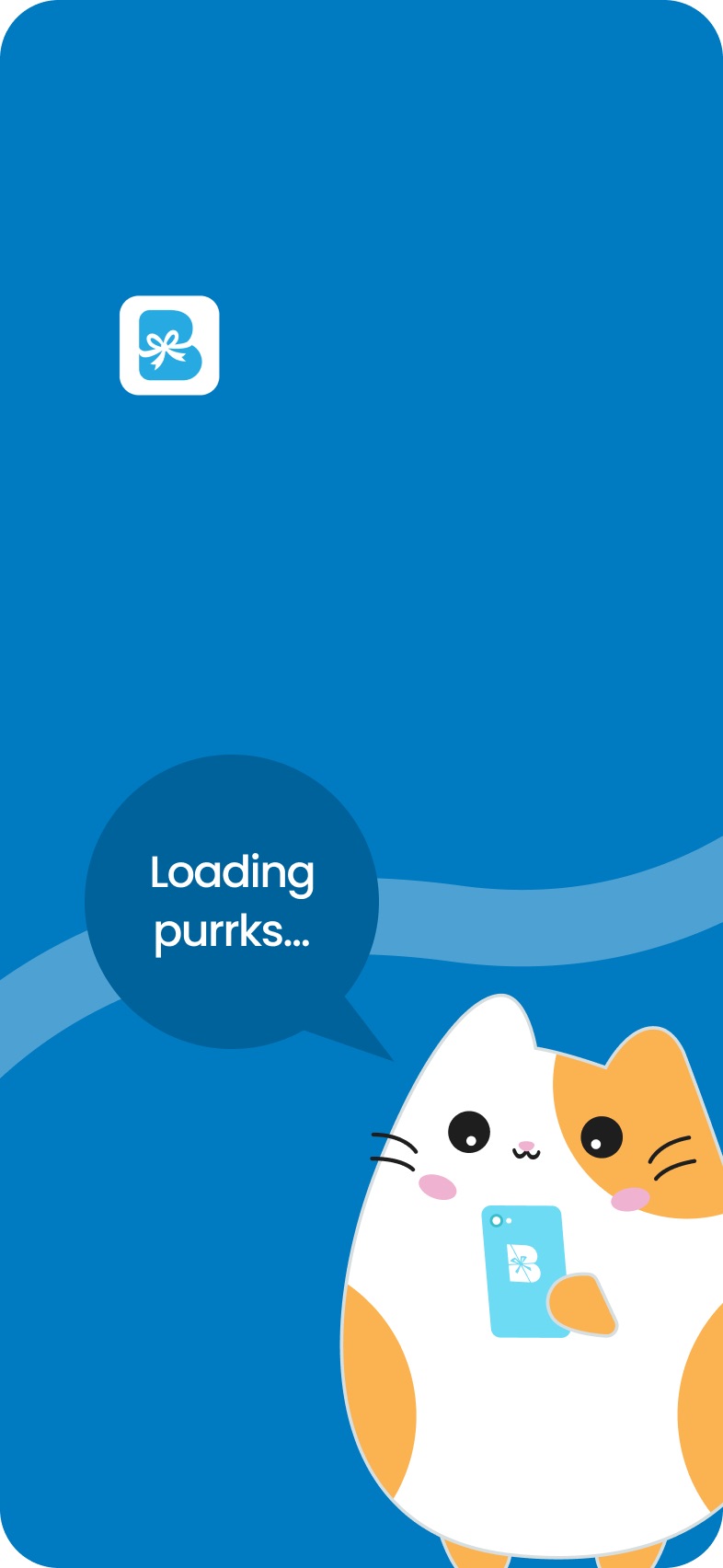
Splash: Blinkie loading points
Earn on everyday spending
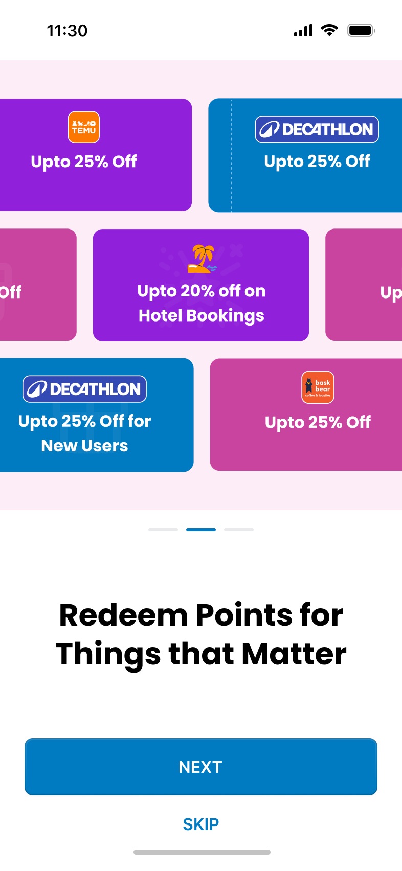
Redeem for things that matter
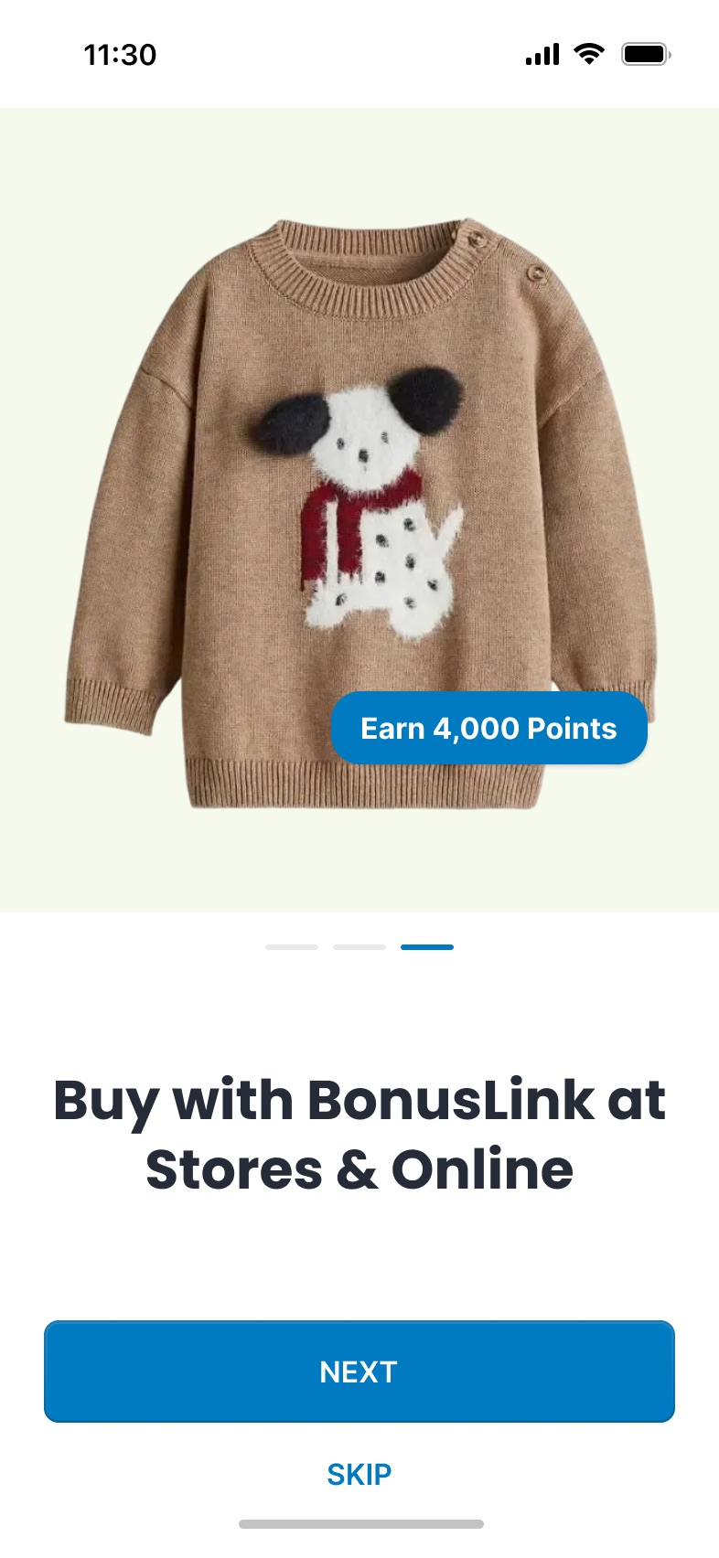
Pay at stores and online
Splash and three intro screens, each showing real products and partners rather than abstract icons.

The member dashboard

The dashboard is the screen members open most, so it had to answer the same questions every time: how many points do I have, how do I earn more, what can I spend them on, and what's new for me.

01

Balance first

Points sit in a raised card with the member QR code beside it, ready to scan at the till.

02

Earn and redeem as shortcuts

Fuel, bills, travel, vouchers and shopping are one tap away, with "More" opening the full list.

03

One nudge at a time

A single task, like verifying your email for 20 points, instead of a stack of banners.

04

Multipliers you can see

Partner offers such as 2x on fuel or 10x on a credit card sit in a swipeable rail.

05

Cards you're proud of

"My Blinkie Cards" shows each physical card with its status, next to the latest collection.

06

Five tabs

Home, Earn, Shop, Cards and Account, matching the website's main navigation.

The final member dashboard in the BLINK app.

One footer, many pages

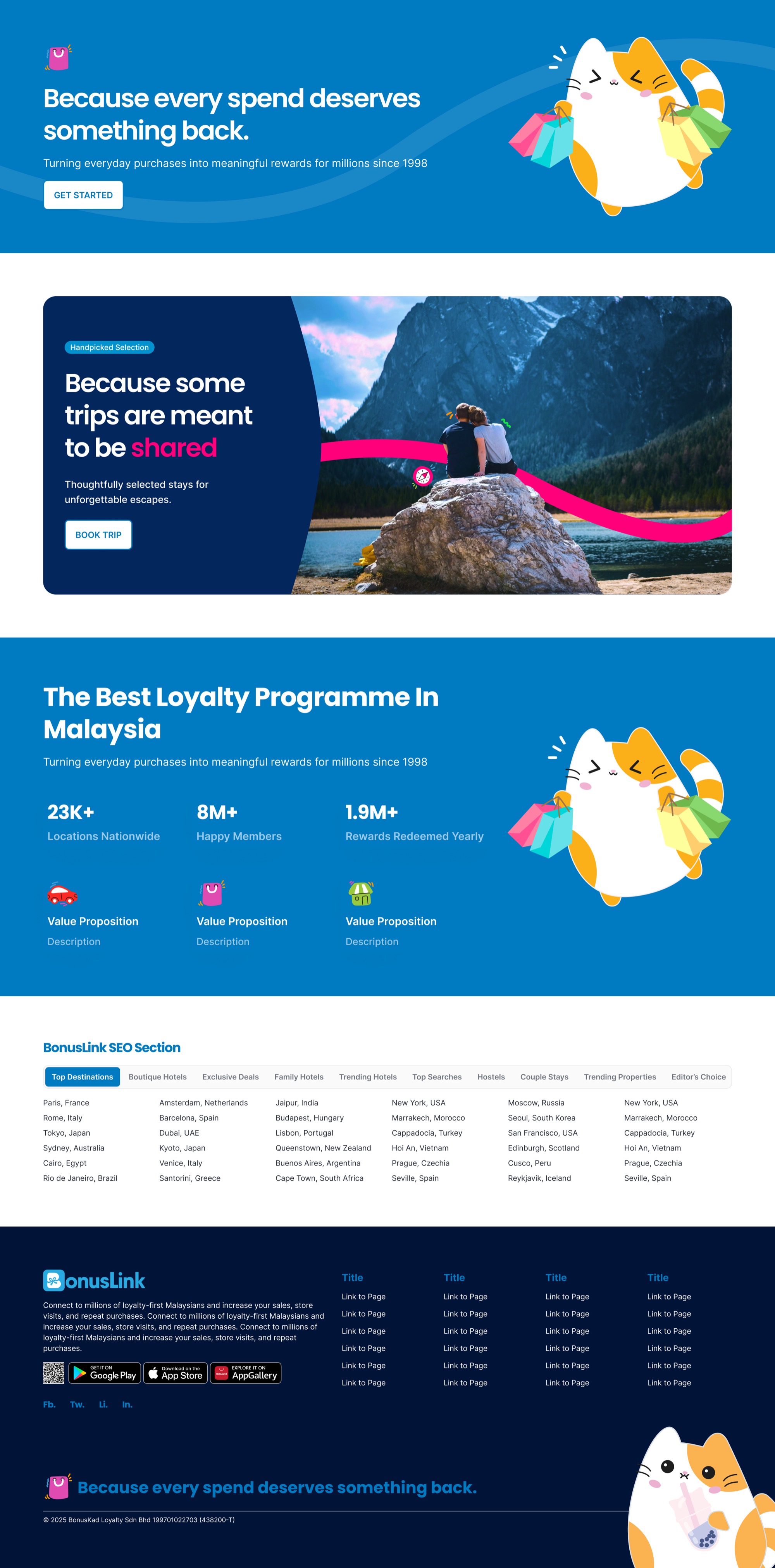
The footer and the bands above it became a kit that every page ends with: a campaign band, a stats band, an SEO link block and the app download, on the navy base. New pages get a finished ending for free.
Footer kitOpen full page
The page-ending kit: campaign band, travel band, loyalty stats, SEO links and the footer.

Learnings

  • Theme first, pages second. Agreeing the tokens, motif and mascot early made every later screen faster and every review shorter.
  • Explain before you sell. Putting earn, redeem and pay ahead of the shop changed the homepage from a catalogue into an answer.
  • Mirror structures across channels. The website's Earn menu and the app's Earn tab share one taxonomy, so members never relearn where things live.
  • Iterate in greyscale. Settling the dashboard's order without colour stopped us arguing about blues when the real question was priority.
Let's talk

End of the scroll, or start of something good?

Tell me what you're building and which hat it's missing.

Chat on WhatsApp